Dark theme is one of the most requested features over the past few years.
The biggest tech companies in the world have made dark themes an essential part of UI. Dark theme’s reduced luminance provides safety in dark environments and can minimize eye strain.
Here are 5 tips you should keep in mind when implementing dark mode in your apps.
1️⃣ Avoid pure dark
Use a dark gray (#121212) as a dark theme base color to express elevation and space in an environment with a wider range of depth and also reduce eye strain.

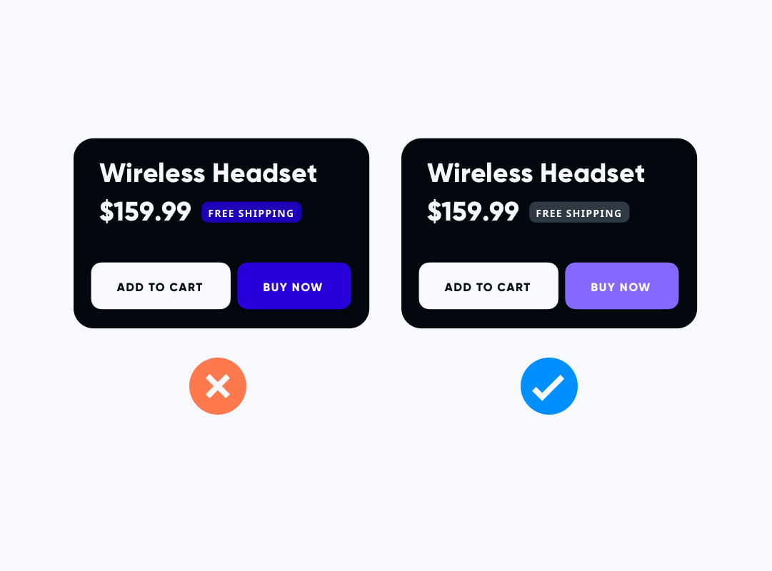
2️⃣ Avoid using saturated colors on dark themes
Saturated colors don't pass WCAG's accessibility standard, instead, use desaturated colors that can be used as a more legible alternative

3️⃣ Accessibility and Contrast
Dark theme surfaces must be dark enough to display white text, to ensure that body text passes WCAG's AA standard.

4️⃣ Communicate Depth
The higher a surface's elevation is, the lighter that surface becomes.

Pic Credits: CSS Tricks
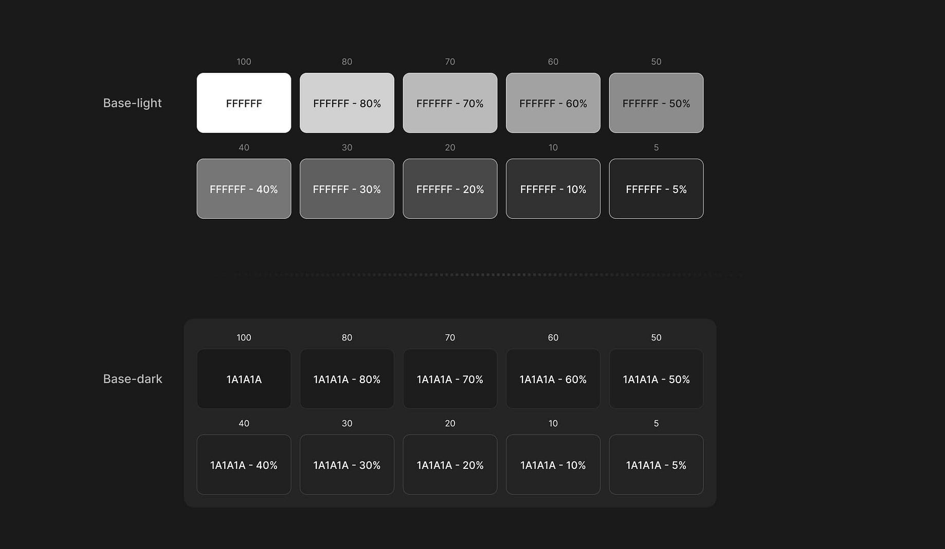
5️⃣ Light text on dark backgrounds
When light text appears on dark backgrounds, it should use the following opacity levels:
Thank you for reading
If you liked this post, subscribe to my newsletter to never miss out on my blogs, product launches, and tech news, and follow me on Twitter for daily threads on web dev resources.
