Web design advice is a dime a dozen on the internet. Many people have different ideas on what the ideal website should look like. This is due to the fact that design is subjective to some extent. What one person finds appealing, another may find repulsive. If only there was a method to get some objective information on how to build successful site design, I'd be happy. Wait, there is! And a good portion of it has been gathered in this post. Stay on the page for some science-backed web design advice.
1. Follow a color scheme
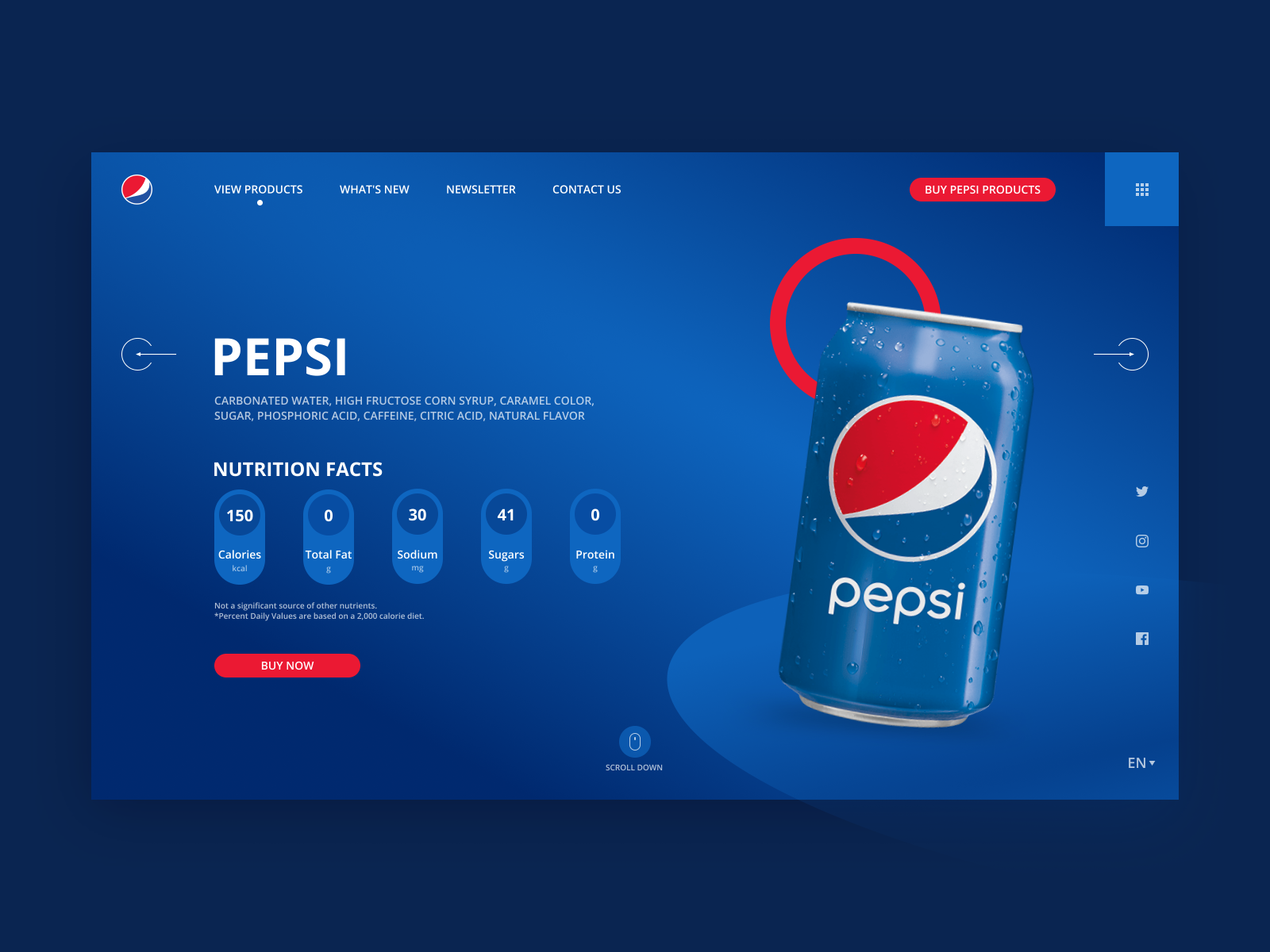
Color schemes always come in handy when creating feature-packed projects. Suppose, you have made a SaaS app and a logo for that. Now if the color of the logo and the website or landing page you're designing, you are ultimately making a brand out of it.
How Do People Respond to Brand Colors?
- Red evokes a passionate and visceral response.
- Purple is a sophisticated yet mysterious color.
- Blue is the most popular color choice for the top brands.
- Green is a color that is synonymous with calmness, safety, and freshness.
A very popular example of how color schemes can shape your brand,

2. Creating responsive design
Responsive Web design is the approach that suggests that design and development should respond to the user’s behavior and environment based on screen size, platform and orientation. With responsive design, you will have the flexibility to scale up rather than scale down.
With a well-functioning mobile product, you have already prioritized features and capabilities and identified the essential elements of your platform.
Look below how Dropbox optimizes responsive design

3. Stick to one font or icon family
All icons/illustrations should come from the same family, and they should maintain the same stylistic rules through out.
Aim for only one or two fonts, three if you absolutely need it. Make sure the font you use co-relates to your brand scheme and feel. Know the difference between serif, sans-serif and monospaced.
Below given are screenshots from Atlassian's website.


4. CSS frameworks
When possible, don't use a CSS framework. It will heavily add to your core understanding of CSS. Some disadvantages of heavily styled CSS frameworks:
- You will probably spend more time overriding styles/functionality than learning core-awesome CSS/HTML features.
- You will have to eventually do something that can’t be achieved using the CSS framework, you either have to build it from scratch or pull in some library that fits your needs, either way, now you will have multiple sources of truth for your own design.
- You’ll need to put in some time learning how to use any CSS framework, I think this time is better spent on learning how to build any component from scratch.
But if you must choose a framework, try going for something which is not heavily styles focused like Tailwind.
5. Appealing to your audience
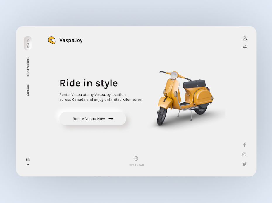
The most important part of building a brand and website is keeping your target audience in mind. All design choices need to answer how you can best serve them and create a positive, memorable and unique experience for them. Without this, you won’t be able to stand up next to competitors. Use language and imagery that will appeal to them and reflect values they can relate to.
An example of how you can connect with your audience via design.

Thanks for reading!
I hope this article has helped you and provided you with some knowledge. You can follow me on Twitter and also support me by buying me a coffee.

Thanks for reading 💝
